Chainsaw Chicken had never been involved in pharmaceutical marketing before.
But when the executives explained their problem, he understood immediately.
Their new medication worked extremely well.
Doctors were prescribing it everywhere.
Sales projections were excellent.
The only thing missing was branding.
“Customers respond better when the product has a personality,” the marketing director explained. “Something confident. Energetic. Symbolic of vitality.”
They had already tested several mascots.
A lion tested aggressive.
A stallion tested arrogant.
An eagle tested patriotic but confusing.
But a rooster tested perfectly.
“Morning energy,” the consultant said. “Confidence. Readiness.”
Chainsaw nodded.
“As someone familiar with poultry-adjacent branding,” he said, “I can help.”
The deal was completed quickly.
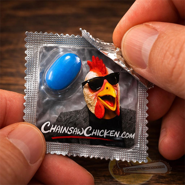
Within weeks the medication began shipping nationwide in small foil packets. Each package contained a single blue tablet and a cheerful promotional image endorsed by Chainsaw Chicken.
Sales immediately increased.
Customer satisfaction remained extremely high.
Everything was going exactly as planned.
Until the complaints began.
Not about the medication.
About the packaging.
Pharmacists started reporting a strange phenomenon.
Some customers who had just taken the medication experienced an abrupt reversal of its intended effect after looking closely at the packet.
The medication itself remained chemically effective.
But visual exposure to Chainsaw Chicken appeared to create what researchers later called an unexpected counter-response condition.
Executives called it something else.
A recall.
Entire shipments were quietly withdrawn from pharmacies.
A brief statement from the manufacturer explained the situation:
“While the product itself performs as intended, certain elements of the packaging may produce unintended visual interactions.”
Chainsaw read the statement carefully.
Then he nodded.
“I like a product with a built-in safety feature,” he said.